
It was a taxing kind of day yesterday....:) So little sewing room time.
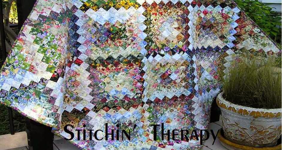
Today I am stitching away on the watercolor I found....and studying the colors and fabrics in it. This is the lower corner that "reads" at a distance as deeper purple. Note the real variety of colors in the fabrics. A few strong purple fabrics blended with medium value purples give that impression among the yellows and blues and greens.
I do see a few repeats here, but it is the variety that makes up the watercolor palette. I can't stress that enough. I have spent years collecting the floral fabrics---paisley prints, feathers, swirly designs also----that I use.

The upper right corner is blue at a distance. Up close you see the reds and greens, and purple tones too. Once again, see the variety of fabrics. That is my palette.
The same word applies to scrap quilts....variety. Vary the value of your preferred color, vary the scale or size of the print to breathe life into your quilt.
I am urging you to visit Wanda at Exuberant Color.....she is the master. Her recent post of her latest Trip Around the World quilt is here. Note that she used 120 different fabrics in it. Not a scrap quilt....planned by design. I commented to her about the shimmer she achieved in the red/pink rounds. It is blended yet distinct at the same time. She responded that she wanted more of that the next time. She also said she learned she needed to choose a variety of prints and value and not try to match so closely. I thought was an excellent bit of advise to remember. Hopefully, we will see another of her TAWs and the process she uses to select those strips...hint, hint :)
Insight: Variety, variety, variety.....it can give your quilt design a lift. Match similar values to get variety, and vary the print.
Enjoy the weekend.....happy stitching.

9 comments:
I agree that colour value is so important and that it does take so many, many different fabrics. Whenever you post on your beautiful watercolour studies they totally fascinate me - I have spent some time studying these two photos here, love the "purple" corner especially. The latest TAW made by Wanda i think is a masterpiece and her use of colour as I have followed her over a few years has amazed me. Hope lots go visit her.
Beautiful, I was looking at the individual fabrics you used and the color values, that purple corner is such a perfect example.
You are making me want to pull out the trays of floral squares again. I have 2 batik ones started that I had to take off the wall at different times, and I want to start choosing for the next TAW that will be even better than the last one. I think I need to make a priority list.
You do what you do so well! And Wanda's quilt is incredible!
You have a real gift for this kind of design, and I love looking at each of your new creations.
I am always amazed at how beautiful the watercolor quilts that you and Wanda both do! I have very few florals and even if I did......my brain doesn't seem to work this way. I love seeing what you do though!
This is a beautiful piece. Your years of collecting floral fabrics is really paying off.
Yes variety in value, color and scale is key to making art and artistic quilts. That is why I don'l like using a single fabric collection to make a quilt. it is too "matchy matchy" and becomes a bland background piece many times.
Your floral collection gives you the variety that adds interest in the quilts. It's interesting to see the changes across the quilt surface and how your eyes move around the quilt.
Post a Comment