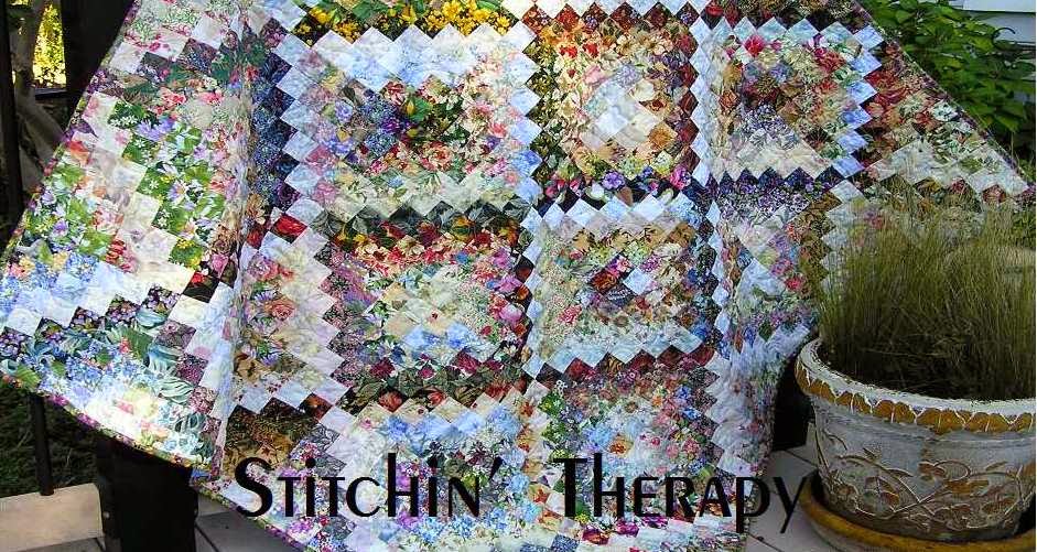

- the work in progress,
- the finished place mat and
- a couple of guides for layout of the values.
I am hoping you can click on the photo and open it in a separate window to print for reference. Remember this is a guide for achieving a blend, not an absolute. Every fabric combination will give different results. The look will be different with the same fabrics depending on how each one is cut and how you place them.

Basically I used about 5 values of floral fabrics. The very lightest fabrics create the focal point of light. Next lighter value has an obvious print on a light background.
Then the medium value prints on tan, cream, light green or pale yellow background. Darker medium values that tend to be darker overall and usually have little background showing come next. The darkest values have dark backgrounds and dark prints.
So if you wish to try this technique on a small project, head to the stash and cut some squares. Prints ---floral, paisley, swirly fabrics work great and are the easiest to blend. Here's a post on selecting fabrics. And a post on value. You don't need a lot of any one fabric.....one or two squares are fine. But you will need variety...the more choices the better.
For full details on using the gridded interfacing see the tutorial Design a Watercolor page under the banner.
And for added inspiration visit Wanda at Exuberant Color for excellent details on how she sorts values, and works her magic in colorwash with batik fabrics.
I will pull some fabrics and hopefully have more insight to share next time. So let me know if you have more questions.
Happy stitching.

9 comments:
Oh, thank you! The diagrams help immensely. This is another one of yours to print out for my colorwash notebook. You explained it so well.
Thanks. These diagrams will be great for that time (whenever) that I decide to try colorwash again.
The slight asymmetry in the value layout is what makes it look like the sunlight is streaming from above and off to one side, isn't it? Clearly these are morning or afternoon placemats :)
This is just perfect! I printed out copies of the photos and link to your blog for our quilt ministry group. I think they will really have fun with this. Thank you so much!
Thanks Debbie for the explanation and diagrams for those stunning placements. I will print them out and think about making them as a gift for one or more of my family members. They might also make mini wall art pieces. Hoping 2018 will be a healthier year for you Debbie.
You are so good to go to this effort to share what you have learned from your experience! I don't know if I will ever dare attempt color wash (and I have next to no florals in my stash), but I am pinning this in case I ever get brave. :)
Thank you for sharing the diagram and wonderful insight into colorwash. I have a bag of shop sample florals and this will be a good way to use them.
You certainly didn't waste any time pulling this together. Thanks for doing so. As Sylvia commented, these would make great gifts. I'm going to make some when I get home from FL at the end of March.
Pat
Thank you for the great tips.
Post a Comment