Showing posts with label border size. Show all posts

Sunday, January 4, 2015

Borders....updated archived post

  While I was working on cleaning up the blog yesterday, I noticed the "all-time" button on the stats section.  I was quite surprised to see this post from January 2010, as one of the most read.   I actually sounded like I knew what I was talking about, too.  It is worth the repeat, with a little updating and added photos.

Borders..how wide do I go?

This year I have had emails asking  how to determine the size or width of the border on a quilt.  I have researched it over the years and even have a couple of books on borders.  A lot of inspiration and how to info, but not a lot of help in planning the width or how to decide.   Finally I researched  the principals of design in art, since quilting is my visual art form.   There are 6 main topics here:  unity, variety, balance, contrast, proportion and pattern/rhythm.  From  these I figured out "my formula" that pleases my eye.

First:  I like to use a narrow sashing--usually 1 inch--to stop the  block pattern and for contrast.  Often in my quilts it is black or a strong accent color to bring out a color in the body of the quilt.   Also for unity the narrowest border should be closest to the center of the quilt.  For my watercolor quilts because they are much smaller in size, I will usually use an inset  "piping style" piece that ends up 1/2 inch. 
The inset piping piece is cut 1 1/2 inches and folded in half wrong sides together.  It is sewn to the body of the quilt top with the raw edges matched and the folded edge toward the center.  The folded edge is not sewn down.  It gives the effect like a  mat on a framed picture.     This photo shows a cream inset piping and  a very narrow dark red sashing and then a dark border. The contrast stops the eye and the color of the piping puts the eye back in the center.   This was a round robin poster project from last year.  Four different quilters created  1/4 of the center, using a variety of techniques. 

Another example of the inset strip used to separate the center 
from the border that creates a mat effect to this watercolor
wall hanging.   Not only did this strip separate the center from
the border, it pushes the focal area back and draws you into 
the center.


 A larger quilt can benefit from an inset strip, too.   This bargello quilt was not quite large enough.  So before the actual border went on, I wanted to lengthen the quilt size.  To the top and bottom I added leftover parts of the bargello strata and framed them with an inset strip.  Then a second inset strip went around the entire center.  Finally the border was added.  


Second:  The  width of the  border should be at least one-half to two-thirds the size of the quilt block used in the quilt.  This proportion keeps the eye on the center of the quilt which is the most important.   The overall finished width of the border should not be larger than one quilt block.

The photo on the left shows a scrap quilt I love, but the border is too narrow overall.  Its just not one of my most successful quilts.  The quilt uses 2 blocks, a snowball block and 9 patch variation.   Both were 6 inch blocks.  The first border (the zig-zag area) is 3 1/2 inches and I used a 3 inch final border of floral fabric.  My thinking was the border would be almost equal  to the block size, and I should not make the outer any larger.  Wrong!  When I look at it now, it seems unfinished, out of proportion, off-balance.  Because I did not stop the design with a sashing, the out border needed to be larger than the inner one. Just one more thing to keep in mind.


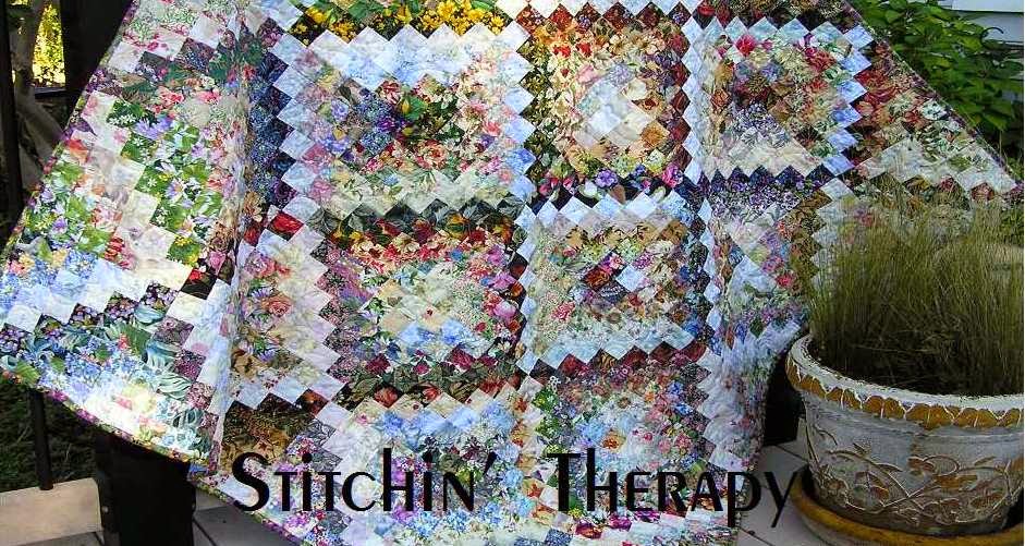
  Potpourri is a more recent quilt made using the Faux Braid pattern.  
The blocks are 9 inch half log cabin blocks.  A 1 1/2" inner strip and
then the 5  outer border  create a good finish.  It's pleasing to my eye
so that means the proportion is about right.   
  Another thing to notice about the border......using a light color border lets the
center design float across the quilt.  A darker border would add weight to
the overall look and create a framed effect...see the bargello above with a dark border.  


Third:  There are always exceptions to the above because each quilt tells its own story and has its own rhythm.    If  I was adding applique (or a type of pieced border)  to the quilt, the outer border  should probably  be wider to keep the overall appearance in balance.   

   And if you are in doubt......skip the border!  Add another row or two of
blocks and then bind it.   

So, my general rule/formula is a border about 2/3 the size of the block used, and be prepared to rip it out or add to it if needed!  When I find the absolute for border width, believe me, I will write the book.  
Until then....happy stitching.

Friday, October 3, 2014

Worth repeating....archived post

From January 2010.....This post is worth repeating, and a little extra update.

Borders..how wide do I go?

This year I have had emails asking  how to determine the size or width of the border on a quilt.  I have researched it over the years and even have a couple of books on borders.  A lot of inspiration and how to info, but not a lot of help in planning the width or how to decide.   Finally I researched  the principals of design in art, since quilting is my visual art form.   There are 6 main topics here:  unity, variety, balance, contrast, proportion and pattern/rhythm.  From  these I figured out "my formula" that pleases my eye.

First:  I like to use a narrow sashing--usually 1 inch--to stop the  block pattern and for contrast.  Often in my quilts it is black or a strong accent color to bring out a color in the body of the quilt.   Also for unitythe narrowest border should be closest to the center of the quilt.  For my watercolor quilts because they are much smaller in size, I will usually use an inset  "piping style" piece that ends up 1/2 inch. 
The inset piping piece is cut 1 1/2 inches and folded in half wrong sides together.  It is sewn to the body of the quilt top with the raw edges matched and the folded edge toward the center.  The folded edge is notsewn down.  It gives the effect like a  mat on a framed picture.     This photo shows a cream inset piping and  a very narrow dark red sashing and then a dark border. The contrast stops the eye and the color of the piping puts the eye back in the center.   This was a round robin poster project from last year.  Four different quilters created  1/4 of the center, using a variety of techniques. 

Second:  The  width of the  border should be at least one-half to two-thirds the size of the quilt block used in the quilt.  This proportion keeps the eye on the center of the quilt which is the most important.   The overall finished width of the border should not be larger than one quilt block.
 In the scrappy mountains quilt top the finished  blocks are 8  inches by 9 1/2 inches.  So  to be pleasing to my eye, the overall border should be no more than 8 inches and the outer fabric no more than 5 inches.   I finished adding the borders today and very pleased with the result.  I used a black sashing--1 1/2 inches wides to stop the pattern, and a 5 inch outer border.  That makes a total border about 5 1/2 inches when finished.   I promise to quit blogging on about this quilt and get it quilted soon.

The photo on the left shows a scrap quilt I love, but the border is too narrow overall.  Its just not one of my most successful quilts.  The quilt uses 2 blocks, a snowball block and 9 patch variation.   Both were 6 inch blocks.  The first border (the zig-zag area) is 3 1/2 inches and I used a 3 inch final border of floral fabric.  My thinking was the border would be almost equal  to the block size, and I should not make the outer any larger.  Wrong!  When I look at it now, it seems unfinished, out of proportion, off-balance.  Because I did not stop the design with a sashing, the out border needed to be larger than the inner one. Just one more thing to keep in mind.
Third:  There are always exceptions to the above because each quilt tells its own story and has its own rhythm.    See the above photo and description to understand this.  If  I was adding applique (or a type of pieced border)  to the quilt, the outer border  should probably  be wider to keep the overall appearance in balance

So, my general rule/formula is a border about 2/3 the size of the block used, and be prepared to rip it out or add to it if needed!  When I find the absolute for border width, believe me, I will write the book.  Until then, happy stitching.

Update:  I have a board on Pinterest of Border ideas that may help with inspiration and a visual reference to all the above words!  Click here to see it. 

Exceptions that work......I only wanted to increase the length of this scrappy quilt.  I added pinwheel blocks made from leftovers to the top and bottom.   It adds visual interest without becoming too busy.


For Heads Up, I used the  border to extend the design.  I followed the shading or value of the edge blocks when I pieced strips of fabric for it.
This border is not obvious, but it does seem to make the design look finished.


Thanks for the questions and happy stitching.

Tuesday, June 5, 2012

Awakenings

  A few lines from a song was the inspiration  for  Awakening I .   I included the words on each label.
   "Like the sun that rises,  From the darkness comes the light.  
      I hear your voice.   And this is my awakening."
  Each time I heard these words a strong mental image came to mind.  The first shimmer of light each morning....that early morning glow you see (if you arise early enough, that is) that streaks across the sky, peeking out from behind the foliage of the trees.  So my intent was to create the source of light that arises from the dark.


    Here     and here   are posts for the start of Awakening I.  The center of the piece blends out to the border on either side.  The strong contrast of dark to light---border to center area---is a favorite technique I like to use.  It creates a frame/border and  I like the way your eye is drawn around the whole piece.

     But by the time I was almost finished with number 1,  I wanted to try another simpler version.    So number 2 was started as a smaller piece.  I decided not to use as many dark squares, but rather selected more medium value squares.  The light is concentrated in the center and a single fabric was used for the border.    Still I can see the shimmer of the early morning light....and the simple  border gives a calmer view.    Or it could be just a little closer to sunrise?                              

    Once again.....number 3.  I still wanted one more shot at this image.   This one was the example I used for posts on using  negative space.    The  focus here is on the  much larger blooms in the dark areas, and again the light is concentrated.  The border is a  very dark fabric that is separated from the center by an inset strip of gold fabric.    The sun is up in this one.    The difference  in each piece is more obvious seen side by side......
  I think the similarities and differences show well here.  The light just shimmers on them.  


    I couldn't decide which shot or angle I liked best.....so I just included them all.    Watercolor quilts are hard to photograph I think.  It is a kind of catch 22.....you need to be back far enough to see the "illusion" created by the blending, and yet you want to be close enough to pick up some detail.  
  Thanks for viewing and sharing my adventure doing a series.  I hope you might be inspired---just a bit.   I think I've said enough.  Happy stitching.  

Wednesday, August 3, 2011

Catch up day

I haven't gotten much sewing done in the last few days, as my brother has been here.  So today is a catch up day. 
I had  2 emails with  questions about the "angled border" on  the cobblestones.   "How did you  do it?" and "How did you measure the lengths of the strips?"   So I thought I would give  better details here on what I did.
    I selected the fabrics I was going to use for borders.  On the right side I wanted a lot of light and a small amount of dark at the bottom.  I had a short piece of the medium (middle print) that I joined to the light strip. I joined those 2 fabrics just as  I would do when joining binding strips on the diagonal. 


This photo is from a quick binding tutorial, so the fabrics are not from this project, but the technique is the same.  The key is to remember to sew from the upper left to the lower right....corner to corner.  Draw a stitching line if you need to.  Cut the extra corner off  leaving 1/4" seam, open and press.   
  I then added the bottom piece in the same manner.  To keep the diagonals going in the same direction, be sure to have the previously joined piece on the bottom.  I had not cut the top or bottom piece to a specific length before joining.  I knew I wanted extra length on the ends when joined.  I used my "slip and slide" method to determine exactly where I wanted the diagonals to be.  
   Slip and Slide:  Place wall hanging on the design wall.  Place the border to be added next to it.  Determine placement by slipping it up or sliding it down.  In this case, I was most concerned with where the light angle was positioned.   Once I figured it out--- marked with chalk or pin on both the wall hanging and the border piece.   Then measure.....the wall hanging to determine the length of the strip you need for the border.  ( You need to keep everything equal, so measuring is important.)   Then pin the border in place--right side to the wall hanging matching the the placement mark.  Measure and mark the border to the correct length.   Sew, easing in if needed. Then  cut off the extra length at the top and bottom. 
  So I hope this is clear and  I will tackle the watercolor questions tomorrow. 
Happy stitching.

Wednesday, May 18, 2011

Fabric arrived....


  Thank you, Deana and Trey,  for my Mother's Day fabric....it arrived and is washed and rolled onto mini bolts.  The one on the right is a backing piece, and no plans--yet--for the others. 
    I cut  some pieces for the border on the batik quilt and put a few up to see how it would look.  Just from this corner section, I can see that this is a better plan.  (Thanks, Wanda, for your input on this.)   By using the medium and dark values in the mixed border, I keep the "light source" in the center of the quilt. And it will blend with the quilt and not compete with all that is going on in the center.    Size---I managed to get 6 inch wide pieces.  Yea!  I like that proportion; the border will be 2/3's the size of one block.   I hate to have  skimpy borders, and I think this one is going to work. 
 
  We are heading out of town for a few days.  We put off one trip because of weather, so rain and cooler temps it will be.  Actually, it sounds great just for a change of scenery. 

Happy stitching.

Monday, January 11, 2010

Off set Borders

Juanita's comment on yesterday's post lead me to review a couple of articles that  Ellen Lindner has on her website.  They are excellent and include lots of photos of her work and art quilts. 
I realized I didn't even mention borders for art quilts or wall hangings.  This is a photo of a favorite piece, The Dogwood,  that I do not have as it was donated to the Alzheimer's Association for auction.  It is only bordered on two sides, the bottom and the right side.  I love the asymmetrical effect and the way the flying geese anchor it.
 I also used the off set border in  Morning Brew, the second photo.  The background was pieced of scraps, and then I selected the border fabric.  I made the border 1/4 the size of the body of the wall hanging.  Still the width of the border in both are in proportion to the overall size,  and the color of  fabric used provide contrast  and unity.  
Like the old saying goes, "whatever makes you happy "....go with it.                         

Sunday, January 10, 2010

Borders..how wide do I go?

This year I have had emails asking  how to determine the size or width of the border on a quilt.  I have researched it over the years and even have a couple of books on borders.  A lot of inspiration and how to info, but not a lot of help in planning the width or how to decide.   Finally I researched  the principals of design in art, since quilting is my visual art form.   There are 6 main topics here:  unity, variety, balance, contrast, proportion and pattern/rhythm.  From  these I figured out "my formula" that pleases my eye. 

First:  I like to use a narrow sashing--usually 1 inch--to stop the  block pattern and for contrast.  Often in my quilts it is black or a strong accent color to bring out a color in the body of the quilt.   Also for unity the narrowest border should be closest to the center of the quilt.  For my watercolor quilts because they are much smaller in size, I will usually use an inset  "piping style" piece that ends up 1/2 inch. 
The inset piping piece is cut 1 1/2 inches and folded in half wrong sides together.  It is sewn to the body of the quilt top with the raw edges matched and the folded edge toward the center.  The folded edge is not sewn down.  It gives the effect like a  mat on a framed picture.     This photo shows a cream inset piping and  a very narrow dark red sashing and then a dark border. The contrast stops the eye and the color of the piping puts the eye back in the center.   This was a round robin poster project from last year.  Four different quilters created  1/4 of the center, using a variety of techniques. 

Second:  The  width of the  border should be at least one-half to two-thirds the size of the quilt block used in the quilt.  This proportion keeps the eye on the center of the quilt which is the most important.   The overall finished width of the border should not be larger than one quilt block.
 In the scrappy mountains quilt top the finished  blocks are 8  inches by 9 1/2 inches.  So  to be pleasing to my eye, the overall border should be no more than 8 inches and the outer fabric no more than 5 inches.   I finished adding the borders today and very pleased with the result.  I used a black sashing--1 1/2 inches wides to stop the pattern, and a 5 inch outer border.  That makes a total border about 5 1/2 inches when finished.   I promise to quit blogging on about this quilt and get it quilted soon.

The photo on the left shows a scrap quilt I love, but the border is too narrow overall.  Its just not one of my most successful quilts.  The quilt uses 2 blocks, a snowball block and 9 patch variation.   Both were 6 inch blocks.  The first border (the zig-zag area) is 3 1/2 inches and I used a 3 inch final border of floral fabric.  My thinking was the border would be almost equal  to the block size, and I should not make the outer any larger.  Wrong!  When I look at it now, it seems unfinished, out of proportion, off-balance.  Because I did not stop the design with a sashing, the out border needed to be larger than the inner one. Just one more thing to keep in mind.
Third:  There are always exceptions to the above because each quilt tells its own story and has its own rhythm.    See the above photo and description to understand this.  If  I was adding applique (or a type of pieced border)  to the quilt, the outer border  should probably  be wider to keep the overall appearance in balance.  

So, my general rule/formula is a border about 2/3 the size of the block used, and be prepared to rip it out or add to it if needed!  When I find the absolute for border width, believe me, I will write the book.  Until then, happy stitching.
Related Posts Plugin for WordPress, Blogger...