
I pulled out a couple of older quilts...waited for the sun to go behind the clouds and took a couple of photos of these quilts from my early stage of working with value.
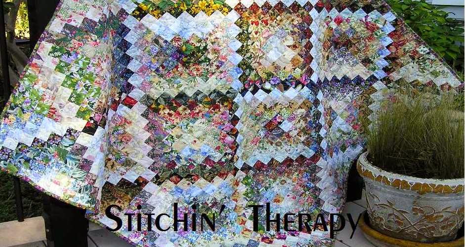
This is Misty Window using the strata technique. I kept the color palette in the blue, green, purple range.

I included floral prints and tonal prints--mainly. The glow comes from the light values clustered in the center. The block values darken toward the edges.

Then I moved on to a simple much loved block....the court house steps. This is a variation of the traditional log cabin block, and it uses lots of strips and makes tons of scraps, too. Summer Garden 2006 was made before I began blogging! Yet the same design principle again......light blocks clustered in the center. And the blocks are set on point. Setting the blocks on point improves the interest and seems to let the blocks blend better.

Here's a close up this quilt. Maybe you can pick out the actual block. You can see how very, very busy each block is. All the better to fool the eye, my dear!
Large setting triangles of medium to dark fabrics were used on the outer edges.

And playing with value continued with batiks. I was quite taken with the cobblestone blocks that Wanda at Exuberant Color was using a couple of years ago. I played around with the blocks to use up every scrap of those precious batiks.
By arranging the units according to value, I created a background setting for applique in Heads Up. I decided where the light source was--upper right--and let the overall value of each cobblestone darken as I worked to the opposite corner. A blended border strip was added to extend the size.
So I had answered my question....using value to blend fabrics, create a light source, and add interest applies to many more techniques and blocks.
What else could I try? Part 2 in a couple of days. Happy stitching.

9 comments:
Just love the first one! What an excellent post on value.
Misty Window--beautiful, and what an appropriate name.
Heads up really catches my eye, too. You use value so well!
Beautiful. Very creative. Love all of them. You are good with color!
I love all 3 of these. I love doing this too. One of the first I did was the Radiant 9 patch. When my mother's eyesight was failing she asked if I had any other quilts for her bed because this one was all 'faded' in the center. It didn't stop me though.
I love everything you make! I don't think I've seen a single thing that you've shown us that I did not like. I can't wait for Part 2.
Love this! Not only do you have an excellent sense of color and of course value, you also do the placement perfectly and get the balance so right. I know you play with them before committing, but it's still something that not everyone can do or see and the reason all of your quilts are so beautiful.
Oh my word... I could look at this post all day! I'm going to have to learn more about strata technique. Your work is so inspiring to me Debbie!
I always love your creations. They are full of so much color. A prayer for you to feel better soon headed up right now.
I love that Heads Up quilt. Somehow I prefer the corner to corner arrangement of lights to darks and the addition of appliqué adds that wow factor!
Post a Comment