Showing posts with label color value. Show all posts

Wednesday, March 14, 2018

Once again...time changes

  
   I caught a couple of hours  or so I thought, in the sewing room yesterday.  I got up to stretch after sewing a few rows, checked the clock and thought  I can sew another hour.  Then I went to the kitchen for a drink, and looked at that clock....what, it was time to start dinner! The time change gremlin got me again! 

   We deliberately did not discuss the time change, nor were any clocks changed until Sunday morning.  Much less stress that way, I thought.   All clocks were changed....except the one in the sewing room.  So now I feel my whole week is just "off" .    Once again!

  But all the Boxed Square blocks are joined...so far.  Just one more row to add and I will call it done.


 Just to give you a tease.....I made a few of the Log Cabin blocks to test my measurements for the planned next project.    They went together quickly and now it will be cutting and planning layouts for starting these.
   I heard from Linda  and she jumped in and has a set of 4 done already.    So glad she is working on these too.

  For anyone else who plans on sewing along....remember the whole point to this layout is to blend values and get a trellis or sashing effect from the darkest value.


   I have some large squares and strips cut.  This is how I am laying them out.  They are in the position they will be sewn in.  I can squint a little bit and see if the blending is working before I sew.   If one strips is too light or dark in a position, I can shuffle thru the stack and find one I like better. 
   Once I am satisfied with the group, I am clipping them together  until they are sewn.


 For good measure I did a couple more garlic knot blocks..... I am working them in as leader and enders.

   These are quite addictive too.  I am enjoying playing with the colors and matching them up for different combos.

    Happy stitching.


Saturday, March 10, 2018

Log Cabin block "recipe"

  Before I start a block,  I need a  guide to help me keep things straight.   Just like when I cook or bake, I need a recipe.

    I labeled this quarter log cabin block  with the sizes needed using 2'' strips.  The notation of light to medium to dark refers to the value of the strip to use in that placement.    This block will finish up at 7 1/2''.
And of course you could add another round of logs to this and make the block larger.  But since I plan on setting this on point, the 7 1/2'' block is large enough.

For each block  Cut:
3 1/2'' square ---- lightest floral
1 @  2'' x 3 1/2'' --- light floral
1 @  2'' x 5''--- light floral
1 @  2'' x 5'' --- medium floral
1 @  2'' x 6 1/2'' --- medium  floral
1 @  2'' x 6 1/2'' ---- dark medium to dark  floral
1 @  2'' x 8''  ---- dark floral

   This is an early "Heads Up'' for a couple of other readers who have asked for instructions to sew along.    Linda from Art in Search and I had a plan to work on this block together.  She is still recovering from surgery, so her pace has slowed down like mine. 
  So for other readers who are in a hurry, I put together this "recipe" for cutting.  You might prefer to use scraps, batiks, or selected colors rather than the floral fabrics I will use.  I can't actually predict how other fabric prints will turn out.....but that could be a fun surprise.   
   I will repeat the cutting list, which is the correct sewing order too, when we get ready to begin in about 2 weeks.  For now, I plan on making some cuts for testing.

  I have one quilt pinned and one to go...and of course I need to get the two quilted-----that is why the 2 week delay.  At least that is my plan for now.
Happy stitching. 

Monday, January 22, 2018

Watercolor place mats and values

  The place mats generated a lot of emails and comments.  I put together this collage that includes:

  •  the work in progress,
  •  the finished place mat and 
  • a couple of guides for layout of the values.   
I am hoping you can click on the photo and open it in a separate window to print for reference.    Remember this is a guide for achieving a blend, not an absolute.  Every fabric combination will give different results.  The look will be different with the same fabrics depending on how each one is cut and how you place them.  


  Basically I used about 5 values of floral fabrics.  The very lightest fabrics create the focal point of light.   Next lighter value  has an obvious print on a light background.  
Then the medium value prints  on tan, cream, light green or pale yellow background.  Darker medium values that tend to be darker overall and usually have little background showing come next.  The darkest values have dark backgrounds and dark prints.  

     So if you wish to try this technique on a small project, head to the stash and cut some squares.  Prints ---floral, paisley, swirly fabrics work great and are the easiest to blend.  Here's a post on selecting fabrics.    And a post on value    You don't need a lot of any one fabric.....one or two squares are fine.  But you will need variety...the more choices the better.  

For full details on using the gridded interfacing see the tutorial  Design a Watercolor page under the banner.  

 And for added inspiration visit Wanda at Exuberant Color for excellent details on how she sorts values, and works her magic in colorwash with batik fabrics.  

I will pull some fabrics and hopefully have more insight to share next time.  So let me know if you have more questions. 
Happy stitching.  

Monday, November 13, 2017

Trust the instincts

   Changing the plans for the baby quilt involved changing other plans, too.  It's one of those ideas that seems to grow on its own and affects anything in its path.  First, I thought I would do something scrappy and quick, and after 3 or 4 blocks of scrappy  I realized that would not make me happy or satisfied.    I put the blocks aside for another adventure later.  Nothing cam to me, so I decided to sleep on it a day or two.
 
  Second,  the fabrics I had pulled for the upcoming mystery were stacked on the thread cabinet and making sad faces at me.    These were not my colors or style of fabrics at all.  My instinct said I would never be happy or even finish a mystery in this vein.  And somewhere, long ago in my insight list I wrote:

          InsightTrust my instincts.  That is why I have them.  

     Saturday was cold and rainy, the sewing room was warm and bright.  Right off my creative muse changed gears and moved things around.

   Those fabrics for the mystery were turned into a pile of orange peel units!  Big fat ones ready for applique on to a creamy yellow background.  I added a few purple and blue prints to the scheme of things.   My instinct is much more satisfied and happy with this direction.   The combination smiles and says special little girl now. 


 I mentioned the 16 patch blocks last week, so in between other things, I did pull out strips and begin to cut them to length for a single block in different combos.   I am not sure of how I want this one to play out, so I thought just a few variations would provide a bit of inspiration....or so I hope. 


Anyway, my main task is to begin appliqueing the orange peel units.  Then we can see if the instinct was right:)

Happy stitching. 

Tuesday, October 10, 2017

A very scrappy Double 4 Patch

    Several years ago, I saved the instructions for the Double Four Patch quilt that  I found  here at Mary Quilts.    Matter of fact, I have saved lots of her instructions as they are clear, and concise, and easy to print.

  A good variety of layouts for the Double 4 Patch can be found on Pinterest.  Here is the link to my board for some I found.   And there are some very beautiful ones based on color and not scraps.

  Last week I had a question about how to select the fabrics when putting the block units together....randomly select a dark and a light?.......was the actual context.   Answer......Ummmm, yes and no.  I don't really delight in being confusing, but sometimes things are not so cut and dried.


  This is the photo I shared for  my scrappy version.  On the left are 2 patch pieces, obviously dark and light, that are ready to become 4 patch units (paired sets in the center above the clothes pin).

Then on the right some 4 patch units sewn with large squares above.   Look again at the 4 patch unit that is sewn.  The print squares are  not true dark values, but rather relatively dark because they are placed next to very real/true light squares.


  Searching thru the stack I found a few more blocks/examples to talk about.    First note the variety of the "light" squares......tan, cream, beige background or neutral prints.   There is even one  that has some obvious dark  there on the right.......the major part of it can be called light. 
  I usually think about Bonnie Hunter's standard.......anything lighter than a brown paper bag goes for the neutral.....even with peeks and pops of other colors.   So a couple of the darks in the upper right hand unit are a bit too brown to fit the light spot.   I decided to put them in as a dark fabric value.

     Then look at the lower left corner......I put that print in the dark spot of the arrangement.   Two reasons:
  •  1. Light background but enough of the dark print is showing....over 50%.  That pushed it to the dark slot for me.   
  •  2.  The  use of lower contrast--in this case, the background blends a lot---can give the element of surprise that pleases the eye.    In vintage quilts you often find fabrics arrangement like that.  It could have been luck, but I prefer to think they had a delightful sense of value and design :)

   Dark selection.....easy.  Dark to light, and again note that I throw some neutrals in that have some color to them, although the color is quite faint.   So for strong darks.....yes, use the random selection for a very scrappy look.  


   A very scrappy look, I say.  Guess you need to see what I mean.   
   This is what is on the design wall of the few blocks I put together already.   For my set/layout, I want the darks, big and small parts, moving up and to the right.  All the lights will be set to move to the left.  

  It doesn't look like much yet, but I love the look in real life!  You can get the idea of the unexpected  effect in some of the blocks.  


    And now that I have brought more confusion probably to this, I will just go sew a few 4 patches.   Happy stitching.

Saturday, October 7, 2017

Question on value

  I had a comment with a question about how to determine value of fabric.  Since she could not find a Ruby Beholder locally, this commenter bought some red cellophane and tried that instead.    Red cellophane is not exactly the same as a value viewer.  It tends to be mis-leading especially for blue-green and turquoise.  ( Thanks, Linda, for helping with this info:)

  I also use this technique for value determination with a black and white photo.  Turn your photo to B&W and the gray scale will really show the value. 
Range of floral fabrics

Same fabrics in B&W gray scale


I saved this lesson on Value by Karen Combs.   She designed a red/green set of a  Value Viewer and explains how to use it too. 
   One thing I will note on the use of any style value viewer is look through the colored glass.  Once again, look through it.   I had students in class try to lay the tool on the fabric to determine value.  It doesn't work that way.....hold the viewer up to your eyes and look thru it.  

  Another point that Karen makes is that some fabrics may be light or medium to dark....depending on what fabric it is placed next to.    Sometimes value is relative!  With multi-print fabrics it may sometimes be very hard to class them on their own.  It is very helpful to place them on the table or design wall next to each other.....even just overlap them.  Look at them and the determination can be made easier.  

The last part of the question referred to selecting fabrics for my leader ender project.  I do have some thoughts on that to talk about, but I must hold them till next week.  My brother and growing up big-time nephew just got in, and I want to visit a bit.  Till then, keep stitching.

Friday, July 28, 2017

Blog banner quilt is Scrappy Trips

    I have been quieter the last few weeks, slower too.  I had debated on resting a longer while from blog posting and not really starting anything new.   I wasn't going to close my blog, but I did feel I had repeated myself so much that I was boring.
Insight:   Things occur and happen to direct you along the road 
you are suppose to take.  There are signs we can chose to ignore, 
but with advanced age I have learned to be more 
receptive to directions.  At least sometimes. 

   All of this to say......this has been a week for emails and questions....not just requests for patterns.  Questions are a good thing.  Questions ask for help, provide direction, point up details I have forgotten, and they let me know what readers/followers want to know.   So after 3 questions about the quilt shown in the blog banner, I think I needed to provide details.  A hunt thru past posts revealed a big lack of details.  I have no idea what happened about that.


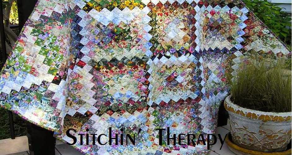
   Trippin'  Thru the Flowers is from 2014.  I began working on this as a Let's Book It project in April/May 2014.  The pattern is from Bonnie Hunter at Quiltville.    She calls it Scrappy Trips.   It is a Trip Around the World variation.....many small trips in fact.  My version is based on value rather than one color.   So.....chains of value radiate around the center square creating diamond bands of value.   Doesn't that sound rich?

  Value......not color.  Value is the lightness or darkness of the fabric.   And the secret to a quilt with the changes in value like this is variety.  You can't have enough floral prints to chose from :)   
 Three things I use to work with value in a water color (or a scrap quilt) are
  •  a value viewer (ruby beholder), 
  • a design wall, 
  • and a camera.   
Learn to sort your fabrics into correct value groups.   I use a ruby beholder viewer.  Additional tip....... Visit Exuberant Color for some good lessons... variety of value  ,  a lesson on value .  I learned great lessons from Wanda's blog, and there is no reason to create my version when she is a master at this.  

Design wall.....big, small, permanent or portable, it is so important.  I can stand back from a design layout about 8-10 feet and see how the values are working together.  In this design I wanted to  see distinct lines of dark and light.  I needed areas of medium value fabrics to blend to the dark and to the light fabrics.  

A camera....if all else fails, take a photo.  Look at it on the computer and amazingly, I can see where problems lie that need to be fixed.  Added tip....turn the photo into a black and white version and you will see instant photo based on value!


Back to the quilt............  
This is how the Scrappy Trips is put together.  4 blocks come together to make up the small trip around the world unit that you see.   If you read thru Bonnie's pattern, you will know that it takes 6 strips for each block unit.    So I had to make several variations for the variety in the full quilt.
   I laid out the strips according to value from dark to light before sewing them together.  It was important to be sure the dark and light fabrics were distinct and not too "mushy".   The lowest block on the left is just a little bit too mushy.  Compare it to the upper corner block that is diagonal to it.  Much stronger light in the center creates the radiating diamond.     So yes, I did have to do some planning--not too much--- to be sure I had light center units forming as well as dark center units.  

 And now a little further along.
   I got better as I went along....selecting fabrics to put together to blend and to have contrast.  
  In the pattern instructions, after you make sub-cuts you unpick a seam to join the rows.  The strongest dark or lightest light fabric was needed to run thru the center to get the pattern.  


   So many Scrappy Trips became Trippin' Thru the Flowers.   And  then became my blog banner.......as it speaks dearly of the floral fabrics I love.   The blended values  remind me of shadows  in the garden in the evenings.  Movement can be strong and still gentle and that is what this quilt says to me.  
Happy stitching.
Tuesday, March 14, 2017

From Guild night

feather bed quilt pattern by Anna Maria Horner (This is a free pattern in the make section at annamariahorner.com):   We had a guest speaker, Anna Maria Horner......  You may not know the name exactly, but I am sure you know the quilt at right.  The Feather Quilt was here last night.
 Anna walked us through her journey to arrive at quilting.....designing, making, experimenting, and her love of color.
 She is self taught, and so her approach is a bit different from more traditional quilters.  She was designing fabric patterns before quilts.  So her more modern take on quilting was fun to see.


Sorry for the fuzzy pictures.
   This was a variation of her feather quilt that she made for her son.   The feathers were done via applique on this one.  Take note of the borders.....lots of lots of strips left over from the piecing for the feathers.   I think I will snag that  idea.   I really liked her make do approach to finish this up.


    The colors were strong and vibrant in this quilt.  She took inspiration from the fabric design to venture into designs with the Dresden Plate blocks.


This quilt used fabrics in her design line that were yarn dyes.   The colors are more muted and appear as the plaids and strips here.
 Again, floral motifs from Dresden plate blocks.
I was blown away with her no rules style...angles, and squares, some things matched and other parts don't.   Talk about being adventurous:)  Nothing has to be set in stone....just pleasing to your eye.


   Even though I took several photos of this one...all were fuzzy.    It was outstanding!  The floral motif appliques were vibrant and fun, and set on gray backgrounds of varying value of light to dark.  A nice blending.  The hot pink was unexpected and give lots of life to this one.
   Her story about the finished size for this was that she planned it, and forgot that the block set on point was larger in the end.  It ended up bigger than king!


spinning.blooms.200.jpg

  And I loved this cute little wall hanging size.  Her original idea was to make four units and create a large quilt.   You can see her stylized flower patterns here.  This is a free pattern on her blog.....here.

Be sure to check out the other free patterns she has too.


  A fun night and great program.    I always need a good jump start to get my inspiration moving.  Happy stitching.  

Tuesday, February 7, 2017

Watercolor question

Shadows Fall
    One of the watercolor emails, asked for a pattern to make the wall hanging called Shadows Fall.   The wall hanging has a "self-border" that is designed at the same time as the center.    The border value is reversed from the center....dark value border on light area, and light value border against the dark sections.  Then along the bottom, it all blends to give the effect that the center is spilling out.


Value placement guide


   No pattern but I did find something that may help.  I know I shared this before, but I don't remember when and was unable to locate the post.  This photo can be save and then printed to use as a reference for value placement.  In this layout the border is 2 squares wide, where as Shadows Fall is larger and has a border of 3 squares.


   Like I said yesterday, start small to learn the technique and to train your eye for value.

Thanks for the questions.....happy stitching.

Monday, February 6, 2017

Put value into your quilts

  The email basket has been full the last few days with questions about the watercolor and color wash quilts.  I have been asked for patterns, and instructions, and for how-to-dos.
    First, I do not have patterns for the water color quilts, or wall hangings.  Each one is unique, and I couldn't reproduce it if I tried.   Each 2'' square is different and will be used or placed differently in different quilts.   The fabrics often dictate the design that emerges.  I work from impressions of things I see, from photographs that I have saved, and from sketches.

  Second, for instructions please see here......Tutorial to Design a watercolor.  It is a page at the top of the blog.  I have links to several posts of questions.  I work through fabric selection---so important---and then on to a tutorial to design.   I talk about the technique of using fusible interfacing, of how I blend the fabrics, how to use the value viewer, or Ruby Beholder.  The entire page is a how-to-do this thing I do :)

  There are books, and photos, and other blogs to research and study, but the best way to learn is TO DO.    I learn best by doing something.  As much as I love to read, if I want to be proficient at something, I must try it for myself.    So I suggest, if you want to do a watercolor quilt/wall hanging, first try to improve your skills at using value by putting some value into your quilts.


   Here's a simple example from last year.  The block is the Bow Tie block.  Block size is 6 '' here.  I used all floral fabrics for the bow ties, and the background fabrics were mixed from white, ivory and tan, to grey, light blue, and light greens.    The lightest value blocks were grouped in the central area.  The layout progressed to medium value to darkest in the corners.
   That simple arrangement fools the eye and gives a color wash effect to the overall quilt.  Of course, I threw in a zinger by twisting a couple of blocks and making a circle too :)


   Pretty much the same thing for the orange peels.   Once all the blocks were made, I divided them into 3 stacks....light blocks, medium, and darkest ones.   Then guess what came next?
   I arranged the lightest blocks first on a diagonal through the center.  Then the medium value blocks blended into the darkest ones, which I placed on the edges and in 3 corners.    A traditional pattern with a colorwash effect......all because I paid attention to the value.


    One last example from my Year of Floral Quilts.  I should say, I am still in my year of florals......I may need to rename it to the decade of florals.  Oh, well.
  The barn raising layout is off set and then extends into the border on one side.  Note the dark center, and then the lighter ring......Value!


  All time favorite pattern for so many quilters is the log cabin block.  This is a log cabin variation, the half log cabin. This past post gives the details.  

  The small photo shows the value arrangement that I used in each block.
  So pick a favorite or traditional pattern add value into your fabric/color selection.  Cut fabrics, make the blocks.  Sort blocks into light, medium, dark values based on the overall effect of the fabrics used.  Play with layout to show case the blocks based on their value.  Stand back and be surprised.

  Maybe I can inspire you to try putting some value into your quilts.  It is more that just contrast.  It is light and dark, sunshine and shadow.  It is spark and movement, and energy and drama.  A small project is the perfect way to experiment, test your self, and to train your eye.  Please try :)
Happy stitching.

Thursday, December 29, 2016

Last one of the year


   I found this photos of my Bow Tie blocks in my photos album from April.  April?  Nine months ago......let's just say before the stuff that happened.  
    I found the top  earlier this month on a hanger, awaiting its turn under the needle.   My goal for the month for this was to get it pinned and quilted.  And yesterday, it got binding done too!


   Bow-quet of Florals got bound yesterday.  I love a finish:)   I quilted it with open swirls, edge to edge.


   I am not sure if I showed this label yet.  I did this one a little differently.  Once the word part was printed off onto treated fabric, I simply added scraps to either side.  Rather than turn the edges under and hand stitch, I used muslin as a backing.   I sewed around all 4 sides and then slit the muslin to turn the label right side out.   Then I top stitched it onto the back.


  Time to shoot a few outside photos.  Please ignore my weeds.


Size is 48'' by 66'' ----perfect lap size to enjoy.


The Ultimate Color Combinations Cheat Sheet  To share:
    I ran across a really good, really simple color combination cheat sheet.     I know I hated the color wheel lessons, too. But they are soooo important!    I actually printed off the long list of color combos to keep handy.  You know, in case I have a no idea in mind day and need a color scheme.  Check it out.
  So the count down is near, as the new year arrives.  I am glad to get back to the usual routine again.  Happy stitching.   

Saturday, October 29, 2016

Pineapple Blossoms growing

Earlier this month I did a post about these blocks.  I thought the light/dark contrast was too great on some of the blocks.  Miss Pat commented I needed to make a few more before I tossed them out.

  So I kept on, adding a couple of blocks every few days......and not going as light--more medium values thrown in.  So I have a light blossom in the center  with darker ones around it.

  I need to cut more strips to length before I make any more blocks.  My gaggle of geese blocks is growing as leader and enders  while working on the blossom blocks.

    I find my mind wandering as I stitch......do you do that?  I am pondering a basket quilt.  A blossom quilt, a flying geese quilt, and a basket quilt.....am I crazy, or making up for lost time?   Naturally I started a new Pinterest board for basket quilts :)  At least I can accumulate some ideas before I begin.

    I also have a colorwash of batiks that I am getting organized to begin playing with.  I snagged a batik kit from Wanda at Exuberant Color last week, and I hope to be able to mix in batiks from my stash.    All this sounds like plans for the rest of the year....I think I will hold off on the baskets until January!
Enjoy your weekend stitching.

Monday, October 10, 2016

Blocks to make

   I spotted a sew along for Fall at From my Carolina Home blog.  Each Friday Carole will post a project....do one or all.  She gives a good tutorial on making the leaf block, too.      Here are my first two, done very scrappy with what I found  already cut in the scrap boxes.   I need to dig some more and cut more background pieces.  Good practice for me.


    I added two more blocks to the Let's Book  It project.   On the wall they look good....but here they look too light (bottom right).    
  Studying this block, I can see that color/value placement really affects things down the road in assembly.  I like the light value strips mixed in, but now see that  I can do better in placing them toward the center of block.  I will try again.


Note:  Take photos of your project.  Then view them on the computer screen.  It is easy to spot potential problems that way.
I am willing to show the "good, bad, and the ugly" as a learning tool......but know it is not required.


Quilting is more fun than HouseworkCynthia is hosting a linky party for scrap projects at Quilting is more fun than Housework .  Check it out for inspiration.

 Happy stitching.   

Tuesday, June 7, 2016

Just make my day

  A very wonderful and day brightening email came last week.  This quilter found my blog via searching for watercolor quilts.  No surprise there, but what she created with the information and tutorial was so inspiring to me.  This just made my day.....think Clint Eastwood and arms full of fabric.

  Christine said....."you gave me the information, inspiration and confidence to have a go - especially useful were the tips on fabric selection.  Here's a pic. of my first attempt (indoor shot as here in S.E. England it has rained all week!)."


 I think she has a natural eye for value.   She did an amazing job with this first piece.  Her future plans include a cascade piece and then a full size quilt   Her next step is to collect more fabrics for variety.    Great job, Christine, and thank you for letting me share this here.  I do hope you will share future projects, too.


   More variety makes it easier to blend value for a watercolor.  
I set up a couple of photos to show the different fabrics I would typically use in a project.  The lightest fabrics on the left are what create the "glow"  in the watercolor. The next row is a medium light group   And the third is more medium value.


   This photo shows the range from medium to dark value.  Variety is  just as important.  It does not mean you need 50 cuts of one fabric, rather a few cuts of at least 50 fabrics.   And don't be afraid of the dark values....they add depth to the entire piece.

Thanks again to Christine for sharing and inspiring me.  I may not be able to teach locally right now, but sharing on-line is a great substitute for me!

  Health update......I have been referred to the Spine Center for testing and a specialist.  I know that is a good thing, but it scares the dickens out of me.   Also, I started some meds for nerve pain  and hope it will improve my functioning for now.  I am dreaming of being able to sew a little....it would feel so good to play with fabric again.    That would just make my day.....happy stitching.

Wednesday, May 11, 2016

Student projects

  I spent today just recouping after Monday night's trunk show and then watercolor workshop on Tuesday.  I had great comments on the trunk show......high praise for me was when one gal called me an artist.  Big smile here.
The workshop was only 3 hours, so the projects are just enough for the students to get a taste of the technique and a small project designed.   A larger project would be more of an intermediate class with some extra design work and planning.
  So......how did they do in class?


  Yvonne is a repeat student and just whipped this right out.  The first time around was at least 5 or 6 years ago and she was still teaching.  She has just been waiting patiently to try this technique again.  Her finishing plan is to add a butterfly applique.


  This is a mother and daughter duo.....sorry the other photo was out of focus.  Shelia came well prepared with stacks of squares....more than enough for both of them.   And some for me, too!


  This is mid-point in Patty's project.  Her comment at this point was "This is hard for me."  I know what she meant....learning to focus on the value and not the color, which traditional quilter's look at, is like stepping off a cliff.  You can't believe that it is possible to mix so many prints together and end up with a project that is not a disaster.
  You can see she will have a very nice piece....with lots of impact.


Joan sent me this photo of her project that she finished designing  at home.  Her big concern was using so many bright fabrics, but they add the needed spark to the project.  I was able to point out a couple of spots to smooth out.  I know she plans on adding applique to finish and wanted that large light area for it.


  This is Pat's project.....isn't it great!  Her light area took on a natural curve that she really liked.  That sparkling orange in the corner is so pretty.  We tweaked this at the end of class and I think it looks so good.

  I will be excited to see how they finish each project off.

Sorting out the quilts and my bags of miscellaneous took most of the afternoon.  I caught up on a few circles and then took a nap!  Tomorrow is fully scheduled and I need to be rested.

See you in a few days.....happy stitching.

Related Posts Plugin for WordPress, Blogger...