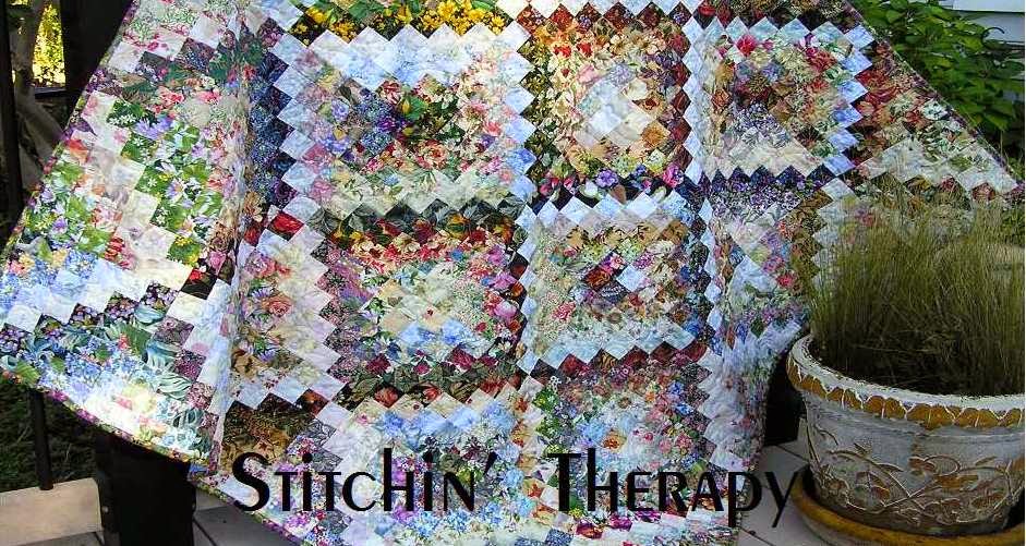
 I shared this watercolor wall hanging in earlier posts from the "look what I had forgotten" stage, through the sewing and on to the borders.
 I loved the comments and one from Wanda at Exuberant Color was that purple is a neutral and I should have a good supply in my stash of it. Such an enabling comment, so I listened to the teacher and quickly ordered more purples!
It is hard to capture the glow in a watercolor quilt. The camera eye focuses on the light and I never know if the rest of the quilt will be the right color. So I took a series of shots in different light to see how it affects it.
Here is a shot inside the house with good light streaming in.

Next I went to the front porch. Bight light behind me, and the wall hanging in shaded area. The purple is okay but the border is washed out.

Next to the back porch area with softer shade and no bright direct light. The colors are better.
Finally, back inside and I threw it on the floor in the office.......nice! Indirect light that is not too bright gives a glow and still allows the colors to show.
I called this one Quiet
Time. Just finding a silent spot to rest and reflect is difficult. So viewing this one causes me to reflect a little bit and calms my spirit. Finished size is 23'' by 30''. Quilted with a meandering stitch in the center and open swirls in the border.
I am pinning my Let's Book It project today, and have a circle to do. If you haven't viewed this month's linky for the circles, here it is. There are some great ideas and circles to see. Lots of creative spirit showing there. Or check out my Pinterest board on Quilty 365 circle ideas. Happy stitching!


12 comments:
Interesting about the lighting and angles for photos with a colorwash. Excellent name for this one. I saw that comment about the purple - I don't use a lot of purple, but can see it in your work.
I have to agree wholeheartedly about the problem with photographing the colorwashes. Doing an auto-fix in an editing program doesn't work either because it emphasizes the light even more. Your piece is so pretty and the border is perfect. It doesn't take away from the main event, just supports it.
It's a beautiful piece, and so interesting to see the series of photos in different lighting situations.
It is beautiful and really neat seeing it in different lights.
Очень красивая работа. Не устаю восхищаться вашими акварелями! :)
What a lovely finish and I think the name is perfect.
I like the idea of purple as a neutral, had never thought of it that way, but it does make sense. You highlighted one of my issues with posting photos, it is so very difficult to get ALL the colors to come out true in the same shot. When I first saw this one in its unfinished state, my impression was that the whole quilt was a lot larger than these finished dimensions. It is gorgeous, and I especially love that neutral border you used.
Perfect name for a perfect quilt. Interesting that the best picture or pictures were taken inside, it must be the right time of day for that light.
Perfect name for a perfect quilt. Interesting that the best picture or pictures were taken inside, it must be the right time of day for that light.
Has such a calming effect to look at this beautiful creation. Great name choice!
Oh yes your last photo shows the quilt off beautifully, not surprised you've called it Quiet Time!
Wanda definitely knows best!!! This little quilt is so pretty and your photography lesson is greatly appreciated. Never knew about the color purple being a neutral, and will begin treating it as such. Enjoy the upcoming weekend.
Post a Comment