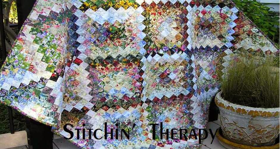
I finally got a photo taken of my latest watercolor. I am very happy with how it turned out. Inspiration was the view of the garden shed from my sewing room window. I have problems with perspective...but the impression is right. I wanted the path to look like it flowed into the border but just could not get it right. Finally, I added the tiny black bias around the inner section, stopping at where the path was. That seemed to create the illusion I wanted. Adding the window to the shed (which isn't really there) was a stroke of luck to push the shed back and make it part of the mid-ground instead of foreground. I also used a bit of colored pencils for extra shading on the shed. Now to find the right place to hang it.
From Bee group last night----Sarge said to add a comment to my entry on quilt labels. Make a label and "don't write on the back of a quilt with ball point pen!" Got to love her. She's telling it right. I have seen quilters do that. It's a pet peeve of mine. That's part of why we put together a guild program on labeling your quilts.
I finished lesson 5 for the blogging. Hope you enjoy the result.

4 comments:
Your wall hanging is lovely.
This is a gorgeous piece! I especially like the way you continued the path down by a break in the edging. It is magical.
Thank you both for your kind words. I can always use the encouragement.
I really like the effect of the little black border. I have done a lot of watercolor/colorwash type quilts too but I have never added anything realistic in them. I think the shed really adds a lot to it. I still have trays and trays of squares so I can certainly try again, LOL.
Post a Comment