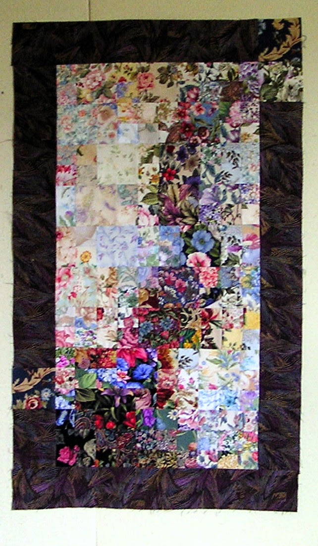
 I worked on the watercolor wall hanging with the cascade of dark and got the border added. I was playing around with it and decided to use the last couple large squares in the border. It sort of works.....the more I look at it the more I like it. And then I asked the "what if" question.
What if I reversed the placement of the light and dark areas in the overall design? What if I did not use an added border, but worked in a narrow dark border into the design?
So while I was thinking about my "what ifs", I checked email.....more questions about my watercolor tutorial, and questions about my watercolor "patterns". I have answered some of these questions before in this post. I will be linking the post on the watercolor tutorial page for easier reference. In general, I do not use patterns, nor do I have patterns for sale. You are welcome to use my designs as inspiration for your own creation....as it would be impossible to exactly duplicate these watercolors.
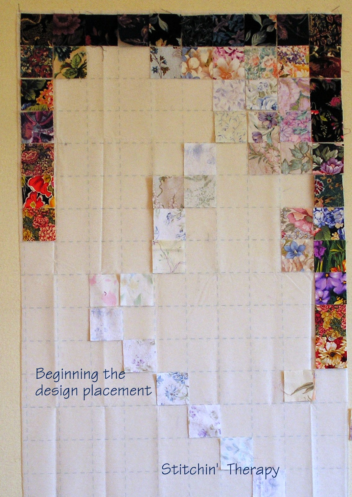
 So when I got back to the design wall, I pulled out gridded interfacing to experiment with a reversed design. This is how I began.
 1. Dark squares in the outer row will go all the way around to create the self border. What is important right now, is not the blending but just getting the darker area defined.
2. The cascade of light is begun by placing the very lightest squares I have in an "s" type wave from the upper corner. By placing them on a diagonal, I can get the design to move across and down the space. Again, blending is not so important. I am just defining the placement.
3. Stand back and look at it. Is the shape smooth, or is it a little to tight and cramped? (I moved a few pieces in the light area and opened up the spacing.)
Filling in the design areas:
I started filling in the upper left corner to get it nice and dark. Dark is important....not medium, not sort of dim....dark. The light area will pop and glow within the dark side areas. I re-worked the upper right corner already, as it was too soft. Yet I see a couple of pieces that could use a little help to blend better.
Taking photos is always a good idea. It lets you see how the design is developing, as well as helping see what is blending and what isn't. As I continue to work down the left side, I will try to remember to take photos to share.
Happy stitching.


4 comments:
I usually prefer not adding a border but sometimes the perfect fabric shows up and then it works. I don't think I've ever made one with the dark in the center and light outside edges. I'm itching to do another colorwash (or 3) so I may have to get out all of the boxes of squares and play.
I just watching how you put these together!
You are a good teacher, Debbie. I'll bet you are great in a classroom setting!
Of course I like them both, but I'm looking at the second one and want to see the rest, LOL.
Post a Comment