I been working right along even though I haven't posted. Blogger has been giving me fits lately.....and the dashboard reader is almost non-existent. I hoped a break would improve the situation, but it hasn't. So I know I have missed a lot of posts from others, and I am trying to play catch-up.
 So on to a couple of finishes. The small watercolor wall hangings that feature cascades have been consuming my time this week.
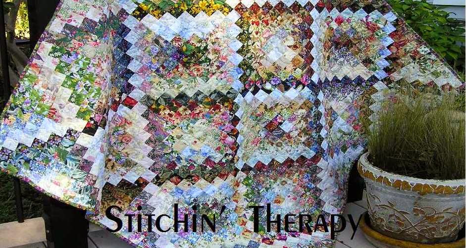
Cascading Blooms was the first one I worked on. I tried a couple of different things with this project. First I used 2 different size squares---2" and 4". By staggering the layout of the larger squares from top corner to the bottom, the design moved easily in a curving effect. Second, the 4" squares also jumped into the border to extend the cascade effect.
The overall effect is different because the light sources fill in the edges. That lead me to the "what if" question.

What if the light source was in the center and generally followed the same curve?
I showed my process for putting together this one here, and here.
The border is what I refer to as a "self-border".....just a single row of dark squares included in the design. Finished with a dark binding, and everything just seems to pop.
Cascade of Light finished at 15" by 36".
A side by side comparison ......I am having trouble picking a favorite.
Now on to the blocks to sew together for the Let's Book It project from last month. I also have classes to teach this week....so I better get prepared.....happy stitching.
 So on to a couple of finishes. The small watercolor wall hangings that feature cascades have been consuming my time this week.
 Cascading Blooms was the first one I worked on. I tried a couple of different things with this project. First I used 2 different size squares---2" and 4". By staggering the layout of the larger squares from top corner to the bottom, the design moved easily in a curving effect. Second, the 4" squares also jumped into the border to extend the cascade effect.
The overall effect is different because the light sources fill in the edges. That lead me to the "what if" question.

What if the light source was in the center and generally followed the same curve?
I showed my process for putting together this one here, and here.
The border is what I refer to as a "self-border".....just a single row of dark squares included in the design. Finished with a dark binding, and everything just seems to pop.
Cascade of Light finished at 15" by 36".
A side by side comparison ......I am having trouble picking a favorite.
Now on to the blocks to sew together for the Let's Book It project from last month. I also have classes to teach this week....so I better get prepared.....happy stitching.


10 comments:
Gosh, those sure are beautiful, Debbie :)
They are both wonderful !!
Both are lovely, and I especially like the flow of the second (borderless) one. When I look at that I can see the beautiful waterfalls along the Columbia River gorge.
These are beautiful ...... I never know whether to compare your work to watercolors or stained glass, but either way it is LOVELY and I always enjoy seeing them.
Blogger reader/dashboard began giving me fits months ago and is the main reason I started using bloglovin. I feel like I'm always missing posts on blogger (though it still works great - so far - for posting, just not reading)
I can see why you are having trouble picking a favorite. They are both beauties. Fun texture with the 2 size blocks. Thanks for sharing.
Hugs
Well shoot, I thought I knew which was my favorite then you put them side by side, now I don't know. I had to refresh blogger dashboard four times before it would show my any blogs just now. I'm getting used to it.
I can't decide, either. : )
They are both beautiful!
Oh, these are beauties, and I'm glad to see you posting again.
Both of your creations are so beautiful, but my clear favorite is the 2nd. one you showed us, with the light source down the center. It appears to enhance the 'waterfall' affect, and I was instantly struck by that. Do you know if there is a pattern available online for obtaining this look? I have seen quite a few, none with patterns, and I definitely would need one before attempting it on my own. Thanks so much for sharing.
They are both gorgeous, but I love, love, love the Cascade of Light.
Post a Comment