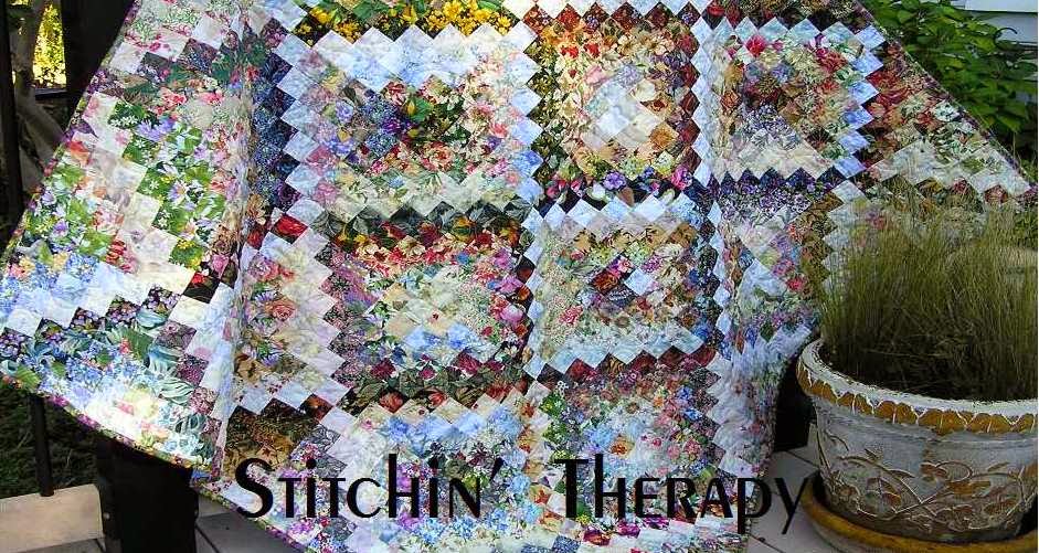
 As easy as I said this block was to construct, it sure has me second guessing myself. Not the construction, but the values of fabrics and the placement. I added another dozen or so blocks to the previous ones.
I found myself thinking I should maybe add dark value sashing between the blocks. For sure the added strips give a very 3-D effect, but for some reason it appears too stark to me. Maybe over contrived or over designed......I decided no to the extra strip for sashing. I am willing to let go. I am willing to let the strips or floral prints fall where they may.
Nature is full of shadows, some are stronger or darker than others. Shadows give fullness and depth to our world and the things around us. I am reminded of the eclipse this past August. At the moment of totality, all the shadows disappeared. The view was flat and one-dimensional. All colors were grayed and dull. I remember feeling like I was in a time warp or in another world because everything was different without shadows.

So off came the extra strips, and the blocks were placed next to each other. I am much happier with the "trellis" effect this layout creates. For now, I will cut some more strips and continue on.
As for the setting triangles, I plan on using a more solid or tonal for that and a narrow border. That is until I change my mind...lol.
Even if Spring can't arrive on time, I am building another spring garden quilt with this one. Happy stitching.

11 comments:
I like your decision too, to let the shadows fall where they may. You are so right, the eclipse last summer was surreal.
You are the queen of floral values. Looking at your blocks, I can stop stressing about finding light lights for the first square. When I was at the Butterfly Conservatory, due to the foliage and shifting clouds (snow), the light values were constantly shifting and flattening and brightening. Your blocks suggest that.
I like it better without the extra sashing too. The totality wasn't strong enough here for me to experience the shadowless surreal moments.
I'm glad you didn't add the dark sashing. It looks great as is. I'm always in awe of how easily you see the hue values. Spring isn't here yet - more snow overnight. Another good day for sewing. ~Jeanne
This is truly stunning. I've never seen such an array of floral tones with that great sashing. Since this is my first view of your sight-Is this a line of fabric or scrappy? I just love those fabrics. mary in Az
Oh how timely. I just started my blocks yesterday and immediately started debating the values with myself. The transitions in the middle range leaving me guessing, but I think when all the blocks are done, they will look fine.
Pat
I think your decision to omit the sashings is the right one, they seemed to disturb the beautiful balance you have going on. I think we all spend way too much time second guessing our color/balance decisions. But that's life I guess ... doing it myself this morning with a new project.
Your blocks are awesome without the dark sashing. Can't wait to see the quilt top finished. ---"Love"
This is beautiful; and we all have the right to change our minds.
I like the quilt just as it is. I really enjoy seeing what you do with your florals in blocks & quilts. You've got to be the best floral/water color quilter I've ever known. You just have that eye for what goes where & the perfect color combinations. Keep doing what you're doing as I never get tired of your work.
Oh this is super Debbie - definitely feels as if we're looking through the trellis onto the garden.
Post a Comment