I had an email from someone who stumbled across my blog asking about how do I blend fabrics. They had seen The World is a Garden on Mary Jo's blog. So I thought I would share part of the lesson I am doing on blending.
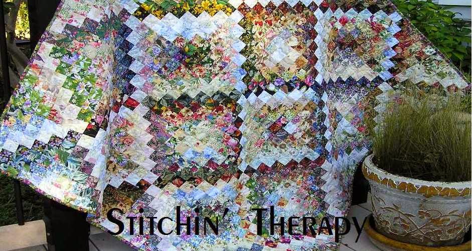
Blending the fabric squares is what creates the watercolor illusion. Nature abhors hard edges and straight lines, and so that is why blending is important. The seam lines when we sew the squares together will create straight lines, so we need to create that illusion of one square flowing and blending into the next one.
Look out your window at a tree or plant. First you see shape and color, then you see the shadow areas that are darker. Then you might notice the light that fills in through the leaves. There may be spots of other color behind the leaves or branches from another plant. That's the blended effect we want to create.
Value is the main way to achieve this look, but not the only one. Sometimes I use the background color to blend from light to medium to dark, or it may be the flower or leaf color that I use to blend to the next square.  This photo shows how I blend from the dark at the bottom to the medium close prints to a fabric with a light background---in 4 squares. As you look at the photo, remember that ¼ inch from each side of the square will be lost in the seam line. Look at the red flower square--- the square below it has a touch of red and yellow at the touching edge. Although most will be lost in the seam line, there will be a hint of color that touches and it will fool the eye to blend the line. Now look above the red flower to the green leaves in the two touching squares. The greens are not the same but they are the same value. Again they will merge and not hard line for the eye to see.
 The keys to achieving blending......value, background color and value, leaf color and value, flower color and value.

OK, enough class room time. I have to finish up the sourdough bread I am making. Deana bought me a starter packet while we were in Alaska. So, off to the kitchen. Happy stitching.

1 comment:
i do a lot of that type designing too. You explained it very well.
Post a Comment