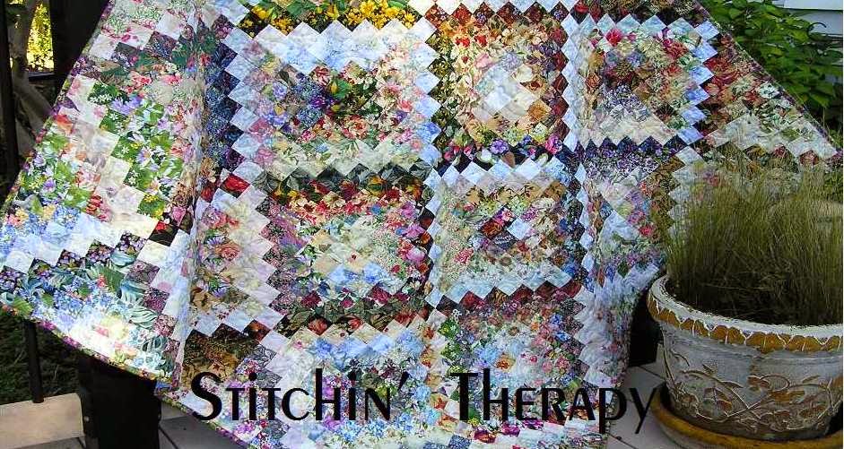
 A few lines from a song was the inspiration for Awakening I . I included the words on each label.
"Like the sun that rises, From the darkness comes the light.
I hear your voice. And this is my awakening."
Each time I heard these words a strong mental image came to mind. The first shimmer of light each morning....that early morning glow you see (if you arise early enough, that is) that streaks across the sky, peeking out from behind the foliage of the trees. So my intent was to create the source of light that arises from the dark.
Here and here are posts for the start of Awakening I. The center of the piece blends out to the border on either side. The strong contrast of dark to light---border to center area---is a favorite technique I like to use. It creates a frame/border and I like the way your eye is drawn around the whole piece.
But by the time I was almost finished with number 1, I wanted to try another simpler version. So number 2 was started as a smaller piece. I decided not to use as many dark squares, but rather selected more medium value squares. The light is concentrated in the center and a single fabric was used for the border. Still I can see the shimmer of the early morning light....and the simple border gives a calmer view. Or it could be just a little closer to sunrise?
Once again.....number 3. I still wanted one more shot at this image. This one was the example I used for posts on using negative space. The focus here is on the much larger blooms in the dark areas, and again the light is concentrated. The border is a very dark fabric that is separated from the center by an inset strip of gold fabric. The sun is up in this one. The difference in each piece is more obvious seen side by side......
I think the similarities and differences show well here. The light just shimmers on them.
I couldn't decide which shot or angle I liked best.....so I just included them all. Watercolor quilts are hard to photograph I think. It is a kind of catch 22.....you need to be back far enough to see the "illusion" created by the blending, and yet you want to be close enough to pick up some detail.
Thanks for viewing and sharing my adventure doing a series. I hope you might be inspired---just a bit. I think I've said enough. Happy stitching.


12 comments:
You always seem to inspire me, these are beautiful and now I need to play again with my little scraps and values.
So beautiful.... all three are incredible!
Watercolor quilts are really hard to photograph. The camera wants to emphasize the light area a little too much and the transition isn't captured well. They are all nice and this is what creates a series, the 'what if' theory.
Yes, three beutiful pieces - lovely inspiration, too, that made for their creation.
I just found your blog...what beautiful work!! I love these! Something else to add to my list of things to try!!
Great job Debbie, you are always so good with watercolor quilts. Beautiful inspiration pieces.
This is a beautiful series. Thanks for sharing about how it evolved.
Debbie, I love this series of watercolor quilts. The name you've chosen fits them perfectly. Thank you for your inspiration & enthusiasum you get from making your beautiful watercolor quilts. I can never see enough of them & I love how you can put your thoughts into words. Thank you!!!
Your watercolor pieces are beautiful! You and Wanda Hanson inspire me. Thank you for blogging and sharing pictures of your artwork.
I love it when I can actually sit down and do some blog stalking, I mean hopping, and find blogs like yours. It was so peaceful scrolling through your blog and looking at your beautiful quilts. Love them! Sorry about your injuries--yuck!
They look lovely hanging together like that.
I have a fascination with watercolor quilts. I found your beauties on Pinterest. They are so soothing but I'm sure a lot of work. I am still an "advanced" beginner. I have seen some kits available, Are these difficult to do?
Post a Comment