
But I am talking about color and choosing fabrics over at
Sew We Quilt !
Jump over there and have a read. Be sure to take your coffee with you, as I did not get to have any this morning.
And thank you Madame Samm for the invite. I should be awake enough tomorrow to answer any questions.
Happy stitching.
Color Talk
This was my guest post on Sew We Quilt February 2012.
Love color? Yes! Always know the perfect color or fabric to pick? Uh, no. Have sweat trickling down your neck, or sweaty palms selecting fabric for your next project? Yep, there I am.
I'm Debbie from Stitchin' Therapy and I do love color. When I began quilting, I had absolutely no idea how to choose colors or fabrics for a quilt. In my first class I was told to use a light, a dark, and a bright. I never finished that quilt, I wonder why? Today I mainly do multi-print, multi-color quilts---scrap quilts and water color quilts--- because the colors make my spirit soar.
Color is what I notice first about a fabric. It will draw me in and influences how I react to a quilt made with it. So before your eyes glaze over and you think "Here comes the color wheel talk, and all those words like complementary and analogous," relax! I'm going to share a simple technique I learned from an artist turned quilter. The class I took from her was not about technique or sewing. It was about selecting fabrics and colors. I consider it my secret weapon to creating wonderful, colorful quilts.

Steps to selecting fabrics/colors
It's a simple idea based on letting the fabric and designers do the work for you. Find a focus fabric you love that has 2 or 3 colors in it. The seventh fabric from the left was my focus fabric.....shades of purple to plum with blues and greens. There's my palette!

Now select other fabrics that "play well and are friendly" with the focus fabric.
- Select a second fabric based on your favorite color in the focus fabric. The color doesn't have to be an exact match. My second choice is right next to it at position #6.
- Select a third fabric based on another color in the focus fabric. My third choice ended up in position #10. Notice anything? My selections were a light, a bright, and a dark fabric scheme.
- Select a "friend fabric" for the second and third fabrics you chose. Make it a shade lighter or darker for depth and variety.
- And so on....Try to select fabrics that vary in scale (size of print), and value. Tonal type prints are great "friend" fabrics.
- Finally, stand back about 6 to 8 feet from your selections. Does anything jump out and not fit? Replace it. Look at the ninth fabric.....does it seem too dark? Yes, probably, but the plum color was so striking with the other fabrics that I left it in to spice things up. Rules can be broken!
- Is the collection of fabric all the same value and seem boring? Note---Value refers to the lightness or darkness of the color you see. The overall value of the fabric is as important as the color. Using a palette of all medium value fabrics will appear flat and boring. Adding a dark and a lighter value will greatly enhance your quilt. If you are not sure of the value, take a photo, look at it on the computer. Squint at it, or take off your glasses like me, and get it out of focus to see the value rather than the pattern and color. Change it to a black and white photo, and you can easily judge the value. It is so worth the effort to do this.

This is the same photo as the above palette converted to black and white. I wanted to be sure the darkest values were scattered throughout my palette and not all in a clump. Don't be afraid of using a dark fabric. The dark values create depth and let the light and medium value fabrics shine.
Selecting the dozen different batiks for this one was done in the same way.

This smaller photo below of the first blocks made gives you a closer look at the fabrics chosen. Can you pick out the focus fabric that I used for the palette selection?

Did you pick the fabric in the bottom left corner? That was it....a beautiful collection of colors in it to chose from. Using the focus fabric made it easy!

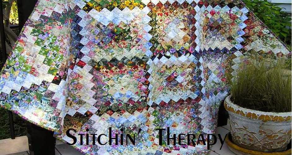
Are you a traditional quilter? In Summer of Love I used 20 different floral fabrics for the very traditional Jacob Ladder blocks. The bold yellow is predominant, and required a careful selection of other fabrics to be successful. I began with one floral featuring lots of colors--including yellow. Each of the remaining floral fabrics were selected because they picked up a color from the focus floral. Some were on dark backgrounds, and others were on lighter backgrounds, and 2 had very blue tone backgrounds. And in the end, all of them blended and worked well together.
Show no fear when selecting fabrics for your next project. Conquer your fear about mixing colors and fabrics. You have been empowered with the secret weapon for fabric selection.... Let the designer and fabric do the work for you. And now, you also have a great reason for building your stash.
Thanks so much, Madame Samm for letting me share my thoughts on color and how to make it work for us all.
Wishing you all a color filled day and happy stitching.
1 comment:
-
NickiDecember 18, 2013 at 10:42 PMThanks so much for this lesson in color. I've copied it off & will read & re-read it over & over again. Picking colors is the very hardest part of a quilt for me. I think that's why I like kits ... because the great color combos are already there. Your quilts are always so pretty & full of color & fun.ReplyDelete

