The email basket has been full the last few days with questions about the watercolor and color wash quilts. I have been asked for patterns, and instructions, and for how-to-dos.
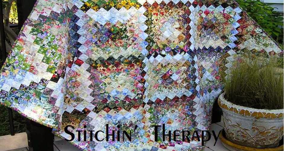
First, I do not have patterns for the water color quilts, or wall hangings. Each one is unique, and I couldn't reproduce it if I tried. Each 2'' square is different and will be used or placed differently in different quilts. The fabrics often dictate the design that emerges. I work from impressions of things I see, from photographs that I have saved, and from sketches.
 Second, for instructions please see here......Tutorial to Design a watercolor. It is a page at the top of the blog. I have links to several posts of questions. I work through fabric selection---so important---and then on to a tutorial to design. I talk about the technique of using fusible interfacing, of how I blend the fabrics, how to use the value viewer, or Ruby Beholder. The entire page is a how-to-do this thing I do :)
There are books, and photos, and other blogs to research and study, but the best way to learn is TO DO. I learn best by doing something. As much as I love to read, if I want to be proficient at something, I must try it for myself. So I suggest, if you want to do a watercolor quilt/wall hanging, first try to improve your skills at using value by putting some value into your quilts.
 Here's a simple example from last year. The block is the Bow Tie block. Block size is 6 '' here. I used all floral fabrics for the bow ties, and the background fabrics were mixed from white, ivory and tan, to grey, light blue, and light greens. The lightest value blocks were grouped in the central area. The layout progressed to medium value to darkest in the corners.
That simple arrangement fools the eye and gives a color wash effect to the overall quilt. Of course, I threw in a zinger by twisting a couple of blocks and making a circle too :)

Pretty much the same thing for the orange peels. Once all the blocks were made, I divided them into 3 stacks....light blocks, medium, and darkest ones. Then guess what came next?
I arranged the lightest blocks first on a diagonal through the center. Then the medium value blocks blended into the darkest ones, which I placed on the edges and in 3 corners. A traditional pattern with a colorwash effect......all because I paid attention to the value.
 One last example from my Year of Floral Quilts. I should say, I am still in my year of florals......I may need to rename it to the decade of florals. Oh, well.
The barn raising layout is off set and then extends into the border on one side. Note the dark center, and then the lighter ring......Value!
 All time favorite pattern for so many quilters is the log cabin block. This is a log cabin variation, the half log cabin. This past post gives the details.
The small photo shows the value arrangement that I used in each block.
So pick a favorite or traditional pattern add value into your fabric/color selection. Cut fabrics, make the blocks. Sort blocks into light, medium, dark values based on the overall effect of the fabrics used. Play with layout to show case the blocks based on their value. Stand back and be surprised.
Maybe I can inspire you to try putting some value into your quilts. It is more that just contrast. It is light and dark, sunshine and shadow. It is spark and movement, and energy and drama. A small project is the perfect way to experiment, test your self, and to train your eye. Please try :)
Happy stitching.
First, I do not have patterns for the water color quilts, or wall hangings. Each one is unique, and I couldn't reproduce it if I tried. Each 2'' square is different and will be used or placed differently in different quilts. The fabrics often dictate the design that emerges. I work from impressions of things I see, from photographs that I have saved, and from sketches.
 Second, for instructions please see here......Tutorial to Design a watercolor. It is a page at the top of the blog. I have links to several posts of questions. I work through fabric selection---so important---and then on to a tutorial to design. I talk about the technique of using fusible interfacing, of how I blend the fabrics, how to use the value viewer, or Ruby Beholder. The entire page is a how-to-do this thing I do :)
There are books, and photos, and other blogs to research and study, but the best way to learn is TO DO. I learn best by doing something. As much as I love to read, if I want to be proficient at something, I must try it for myself. So I suggest, if you want to do a watercolor quilt/wall hanging, first try to improve your skills at using value by putting some value into your quilts.

That simple arrangement fools the eye and gives a color wash effect to the overall quilt. Of course, I threw in a zinger by twisting a couple of blocks and making a circle too :)

Pretty much the same thing for the orange peels. Once all the blocks were made, I divided them into 3 stacks....light blocks, medium, and darkest ones. Then guess what came next?
I arranged the lightest blocks first on a diagonal through the center. Then the medium value blocks blended into the darkest ones, which I placed on the edges and in 3 corners. A traditional pattern with a colorwash effect......all because I paid attention to the value.
 One last example from my Year of Floral Quilts. I should say, I am still in my year of florals......I may need to rename it to the decade of florals. Oh, well.
The barn raising layout is off set and then extends into the border on one side. Note the dark center, and then the lighter ring......Value!

The small photo shows the value arrangement that I used in each block.
So pick a favorite or traditional pattern add value into your fabric/color selection. Cut fabrics, make the blocks. Sort blocks into light, medium, dark values based on the overall effect of the fabrics used. Play with layout to show case the blocks based on their value. Stand back and be surprised.
Maybe I can inspire you to try putting some value into your quilts. It is more that just contrast. It is light and dark, sunshine and shadow. It is spark and movement, and energy and drama. A small project is the perfect way to experiment, test your self, and to train your eye. Please try :)
Happy stitching.

9 comments:
Yay, going back and looking through those tutorials is always inspiring. I've been wanting to get that gridded interfacing, are you using the one inch grid but laying it out in two inch blocks?
It is only because of all the hard work you do planning, thinking, cutting, making, writing- that you could explain value so well. Thank you for such a explanative post and sharing so freely. Now, I want to go cut some fabric!
Adding value - even if not doing a watercolor design - makes for a much more pleasing quilt - or any type of art work!
Well said, Debbie!
Always great to get a clearly written reminder of solid design principles. I need to take a look at your tutorial, too. Thanks!
That is good advice, just do it to learn.
Well said. Well demonstrated. Excellent value tutorial!! I'm off to play ---
What you say is so true of every artistic medium. It's what makes life continually interesting.
Excellent post, and one of the things I struggle with much of the time.
Great post Debbie and I love the way you have the barnraising layout creeping over into the border.
Post a Comment