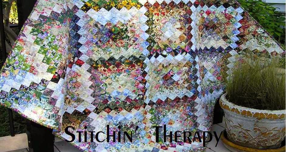
I recently had questions about blending fabrics and where to go for information on it. There are many books on the watercolor technique and all will have some general information, but there is nothing like hands on, learn by doing. I went through some older posts and found this one from 2015 to re-post and share.
Selecting fabrics that blend
I promised a post on blending fabrics last week. Looking back through older posts, I realized I had started covering this topic back in 2012. So I have selected part of that post and added a bit more to help with this part of watercolor technique.
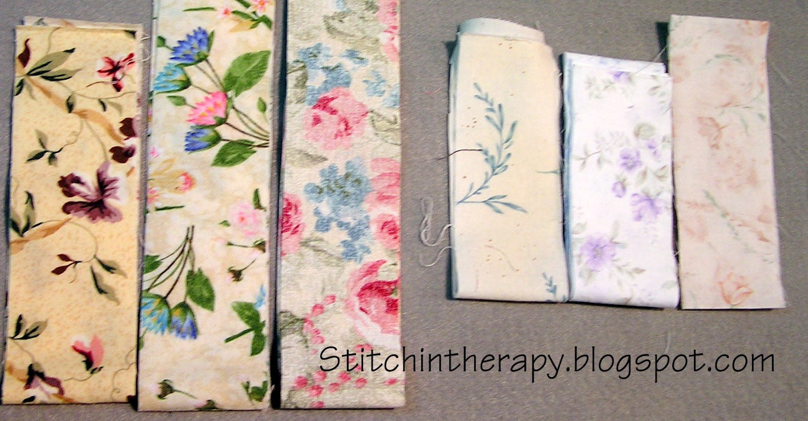
On the right are the "light fabrics". There is more background color---from white to light tan---showing and the design or print is light or faint looking. Note the low contrast between the background and the print. These can be hard to find, so when I do discover them, I buy a lot!
Update note: Janet reminded me that often the backside of a fabric will work for a light. When you have a difficult time finding the right fabric, flip it over and see what the back side looks like. It could be just what you need! Thanks, Janet.
In the above photo...... On the left, are some light medium fabrics. Again, the background is light, but the print is stronger and has more contrast with the background. The one on the far left is a great example of a "sprigged" print. A 2" square of this one can blend into a very light area like a sprig the extends from a branch of a tree.
 This photo shows a collection of medium fabrics. These are the work horses in watercolor.....they often bridge from a lighter area to a darker one....as well as being the most used. The background may range from light to darker cream, or tan....maybe a light green even. The design is darker and in good contrast with the background. Usually there is less background that shows, making them "closer packed".
  And the dark fabrics......give the watercolor depth and life. The background color is dark.....black, brown, blue, green.....and the design has strong contrast. The areas of light and dark on the dark background provide the way to blend and merge the squares for a water color.
Added note: When looking at this type of floral print, do not focus on the individual bloom or pattern. Rather look at the over all impression. The dark background color/value will push these prints into the medium/dark category. But there may be individual squares that are cut that can be medium value or light/medium value. Those squares will help bridge from a dark area to a lighter one.
 I talk so much about the right fabric, I thought I should also mention the wrong ones. These are great fabrics, they just don't work well for blending in a watercolor. Why? Mainly because they are one or two color fabrics. Either they "read" as a solid or a polka dot from a distance. Step back from the computer and look at them again. The second fabric---purple paisley---fooled me when I bought it. I thought it would work, but just does not blend well because the design is so evenly spaced. So save these fabrics for another project or turn them into backings.
If you have selected the right type of floral and paisley style prints, you still may face the challenge of making them blend. Remember the real blend comes the value not the color you are using. I created a collage photo to help show a simple blend from lightest to darkest.

Top row------ from the lightest to the darkest. If the lightest fabric is in the central area of the watercolor, you need to move out to the edge getting darker as you go.
Middle row---- a close up detail of the first 4 fabrics. The second fabric is a "sprigy" one that has a lot of background showing and introduces a darker stem. The third fabric picks up on the background color of the second fabric and has more of the darker stems and leaves.
Bottom row--- the second fabric in this row is what I consider a workhorse fabric.....it does so much! Generally it is a dense or packed floral pattern with little or no background showing. It has strong contrast in the pattern with distinct light and dark areas. So it can go from medium value to dark value in just one square.
The last two squares in this row are dark values with the square on the end having more black background showing. That is the drama factor.
 This is one of the Cascade wall hangings. You can see how I used the above blending technique to quickly move from the center of light to the darker edge. One other thing to note on this is the effect of large/huge blooms....like the red at the top left. By positioning 2 or 3 squares that have a large flower in similar color next to each other, you create the appearance of a very large flower.
And the rest is up to you now to experiment and train your eye.
- Get use to using the value viewer.
- If a square doesn't work, give it a quarter turn or flip it over to see if the value is better.
- Stand back....about 10 feet before you judge too harshly.
- Take a photo and view it on the computer.....changing it to black and white from color is a great trick I have not mentioned. You will be surprised at the effect of just viewing the value.
- That is also a good tip to use on traditional quilts. Sometimes we use too many medium values and then wonder why the pattern looks flat or uninspiring.
Happy stitching.

5 comments:
Thanks Debbie. As for taking the photo, many cameras - even the one on my phone, will allow you to take the photo in black & white - or just use it as a value viewer. I use that trick quite a bit.
I'm so glad you reposted this! Tons of useful info and tips here. Thanks!
Excellent re-post Debbie, great for any quilter to read even if they don't make watercolour quilts.
What a phenomenal description of such a difficult process. To train the eye to see value, categorize it and use it against other values is a black box for so many people. It does take practice and the brain has to work hard. I am printing out your words and keeping them nearby to keep focused.
Really nice discussion for blending. :)
Post a Comment