From July 2017.......
Insight: Things occur and happen to direct you along the road
you are suppose to take. There are signs we can chose to ignore,
but with advanced age I have learned to be more
receptive to directions. At least sometimes.

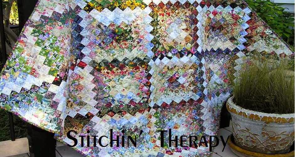
Trippin' Thru the Flowers is from 2014. I began working on this as a Let's Book It project in April/May 2014. The pattern is from Bonnie Hunter at Quiltville. She calls it Scrappy Trips. It is a Trip Around the World variation.....many small trips in fact. My version is based on value rather than one color. So.....chains of value radiate around the center square creating diamond bands of value. Doesn't that sound rich?
Value......not color. Value is the lightness or darkness of the fabric. And the secret to a quilt with the changes in value like this is variety. You can't have enough floral prints to chose from :)
Three things I use to work with value in a water color (or a scrap quilt) are
- a value viewer (ruby beholder),
- a design wall,
- and a camera.
Learn to sort your fabrics into correct value groups. I use a ruby beholder viewer. Additional tip....... Visit Exuberant Color for some good lessons... variety of value , a lesson on value . I learned great lessons from Wanda's blog, and there is no reason to create my version when she is a master at this.
Design wall.....big, small, permanent or portable, it is so important. I can stand back from a design layout about 8-10 feet and see how the values are working together. In this design I wanted to see distinct lines of dark and light. I needed areas of medium value fabrics to blend to the dark and to the light fabrics.
A camera....if all else fails, take a photo. Look at it on the computer and amazingly, I can see where problems lie that need to be fixed. Added tip....turn the photo into a black and white version and you will see instant photo based on value!
 Back to the quilt............
This is how the Scrappy Trips is put together. 4 blocks come together to make up the small trip around the world unit that you see. If you read thru Bonnie's pattern, you will know that it takes 6 strips for each block unit. So I had to make several variations for the variety in the full quilt.
I laid out the strips according to value from dark to light before sewing them together. It was important to be sure the dark and light fabrics were distinct and not too "mushy". The lowest block on the left is just a little bit too mushy. Compare it to the upper corner block that is diagonal to it. Much stronger light in the center creates the radiating diamond. So yes, I did have to do some planning--not too much--- to be sure I had light center units forming as well as dark center units.

And now a little further along.
I got better as I went along....selecting fabrics to put together to blend and to have contrast.
In the pattern instructions, after you make sub-cuts you unpick a seam to join the rows. The strongest dark or lightest light fabric was needed to run thru the center to get the pattern.
 So many Scrappy Trips became Trippin' Thru the Flowers. And then became my blog banner.......as it speaks dearly of the floral fabrics I love. The blended values remind me of shadows in the garden in the evenings. Movement can be strong and still gentle and that is what this quilt says to me.
Happy stitching.
 UPDATE: After a few more comments and emails I realized there was a beginning section not detailed. So I am adding a few more details here. This is one of the stratas I used. The strata is 6 fabric strips about 13'' by 2'' that are sewn together darkest to lightest in this example. The blend might run from very dark to light medium, or dark to medium to light. It will depend on your fabric selections.
When the strata is sewn into the tube and the sub-cuts are made, The darkest fabric should be the bottom left corner of your layout. Again, the technique for sewing is found at Quiltville under the free tab. It is the fabric choice that makes this version different.

11 comments:
I just adore this quilt. Do you mean you make some blocks that have the darkest value center and some that have the lightest value center? I enlarged the photos and tried to figure it out.
Thanks for going over this one again.
So pleased to read this post!, I have always loved your banner. I have yet to make a Scrappy TAW but having read this post I think it's time I put all my lovely Hoffman florals to work, I'm guessing they would work beautifully. Thanks for sharing with us.
It is a beautiful quilt! I'm not surprised that your readers want to know how to make one.
This is a great post. Thanks for sharing it again.
Thank you. I've been quilting for a while and even when I garment sewed, selecting fabric (or even placement of fabric) has always been a challenge. The links you shared were also insightful. The Trippin through the floweres quilt is a stunner--mostly from this distribution of values.
Thank you. I've been quilting for a while and even when I garment sewed, selecting fabric (or even placement of fabric) has always been a challenge. The links you shared were also insightful. The Trippin through the floweres quilt is a stunner--mostly from this distribution of values.
Thanks for the additional hints. I haven't worked on my watercolor scrappy trips in a while, partly because not all the blocks seemed to be working. I'll have to pull them out and see if I can identify the problem. This is still one of my favorites of your quilts and I'd really like to finish mine.
Pat
Thank you.....blending values is what I really enjoy doing.
This quilt is incredibly gorgeous! No need to say more, except I wish I could make one! ---"Love"
Hi Debbie - what a surprise to see this posting! Love seeing the quilt top laid out - so lovely.
I found that the red value finder played a big part in my selections - because some that I thought were light were showing my "medium" fabric colour being lighter and brighter! I've not really had to use it before but it certainly helped big time and I learnt something new!
Again thank you - everyone loves the top, but the borders will have to wait a little longer. This is definitely my happy quilt. I was making it for the guest bed - but I may have to snatch it away for our bed instead! Bigger border then!
It is a beautiful quilt. And you are always so good to answer reader questions thoroughly!
Post a Comment